All the Buildings Satellites Can See: The Global Building Atlas
The English word building is a gerund or a verbal noun, sneakily suspending one of the most physically stubborn things of everyday life into a liminal state of being both object and process. In German, by contrast, Gebäude, the past participle of Bauen (to build), is more settled: it’s a “built,” definitively finished. It’s unclear when, where, or why exactly in the development of the two languages this subtle difference emerged, but the gerund is already apparent in the Old English or Anglo-Saxon bytlung, while the Old High German gibūidi has the meaning of something built.
Without presuming that ancient philological distinctions can be extrapolated to modern habits of mind, it's tempting to wonder if the difference between building and Gebäude explains why a German team at the Technical University of Munich recently mapped 2.75 billion buildings on the planet, a figure they claim is comprehensive. Putting aside the veracity of this number, the Global Building Atlas (GBA) is like an interactive, three-dimensional Nolli map, a digital figure-ground (and -air) diagram of the world, with building volume as its primary metric — all made possible by the thousands of satellites now networked in the sky that put real-time imagery of the earth within reach. One might think of GBA as an imaginary — and not merely innocent imagery — made possible by big data, GIS, and the funding supporting both. What this imaginary helps people imagine, how it directs questions, and what it skews is far less subtle than the distinction between building and Gebäude and of more far-reaching consequences.
Figure 1. “Building Volume Distribution,” Global Building Atlas, screenshot, January 13, 2026.
Figure 2. Giambattista Nolli, Nolli Map of Rome, 1748.
The website is rich and full of interesting possibilities. It allows users (a word that deserves its own interrogation) to explore building heights, footprints (building “polygons” in the jargon of digital mapping), volume, morphology, density, and geography, from the fine grain of the individual structure to the city, regional, and global scales, at thirty times the resolution of previous models. In the words of the team, the website “unlocks unprecedented geospatial analysis possibilities, as showcased by a better illustration of where people live and a more comprehensive monitoring of the progress on the 11th Sustainable Development Goal of the United Nations.” While most of their own analysis is about the technical possibility or proof of concept, they imagine the tool will help address global issues such as “inequalities and urban poverty, inadequate transportation infrastructure, air pollution, and limited access to open public spaces.” It will unlock comparative analysis on a wide scale, if of a limited number of building variables, unleashing new ideas and approaches to political questions. With such ambitious goals, it’s vital that the tool be subjected to critical analysis. This article is a modest first step.
Figure 3. How the GBA displays its data. Source: https://github.com/zhu-xlab/GlobalBuildingAtlas.
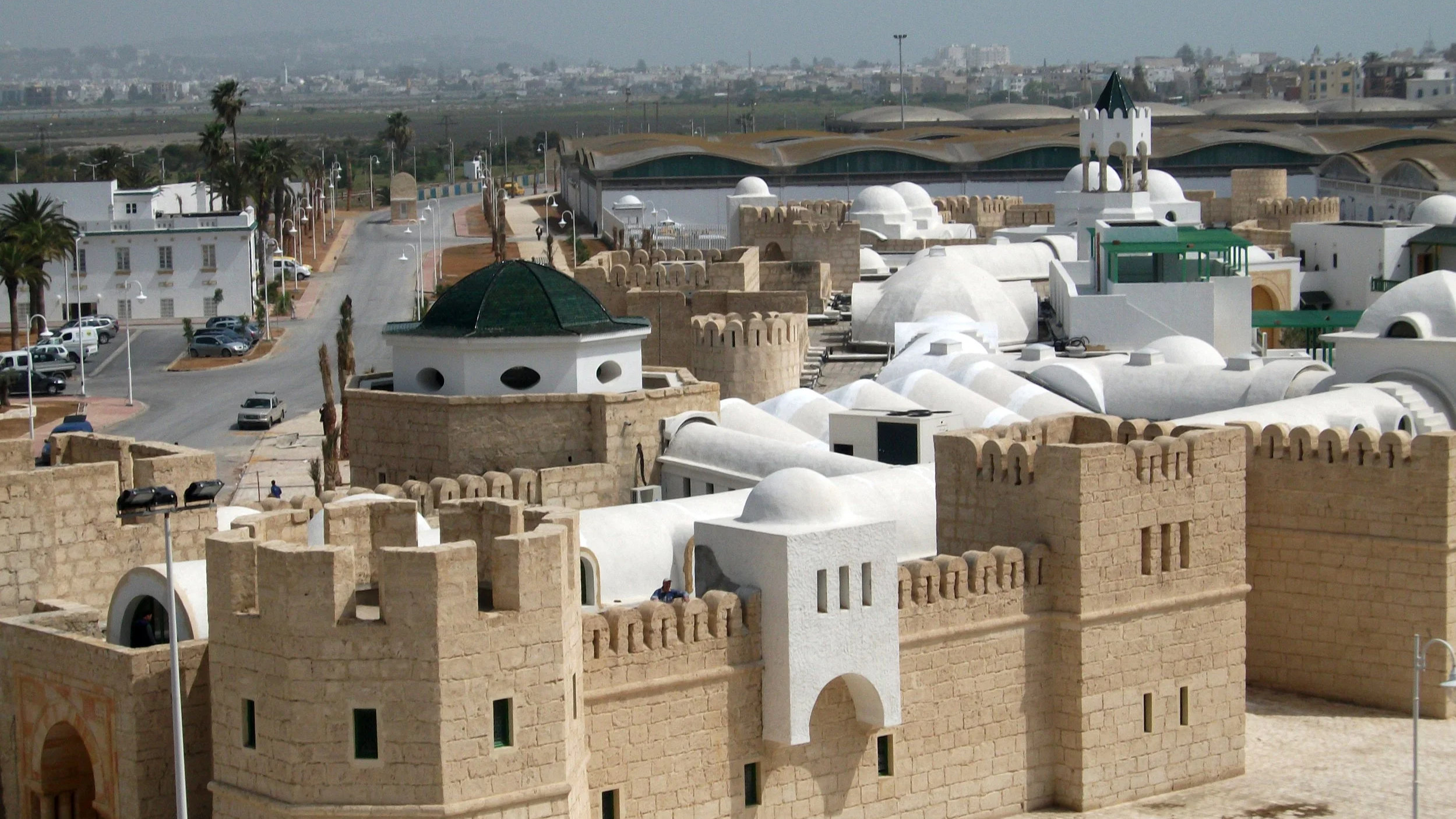
The limitations are obvious. To begin, despite its name and its reliance on recent satellite data, the atlas has huge gaps, betraying its reliance on older, uneven sets of data. Africa, for instance, is nearly blank: “owing to the lack of reference data in Africa, it was not possible to conduct a quantitative evaluation in that region.” The GBA, it turns out, concentrates not on the globe but on twenty-eight cities in Asia, Europe, the Americas, and Oceania. In doing so, it perpetuates the gap in information about the Global North and the Global South, already so apparent in the paucity of records, from cadastral maps to state archives, in the latter.
““From the point of view of science and technology studies, it might be fairer to think of this mapped data set as a scientific fable. “”
Another major challenge to the project is the difficulty of estimating population and other kinds of social and economic data from building volume. Finland, the site reveals, has six times the per-capita building volume of Greece. It is easy to imagine how this kind of crude ratio could lead to dangerous assumptions about people and their built environments. When its authors consider per-capital building volume alongside per capita GDP, they claim “the superior discriminative power of building volume per capita in capturing differences in economic development.” But is wealth — economic development and GDP — the only factor? Is Finnish culture more wasteful than Greek? Does it have different standards for living and working space, perhaps owing to different industrial activities or cultural norms? Do people in Greece, given the lower latitude and warmer weather, spend less time indoors? GBA poses none of these questions, instead reducing people to data extracted from the shape of their buildings. Even if raw population could be estimated from building volumes, it can’t tell us anything substantive about the people who live there, their socio-economic arrangements, or relationship to food, healthcare, education, and other institutions.
Figure 4. Interactive Nolli Map Website, James Tice (University of Oregon), hosted by Stanford University.
Unlike the Interactive Nolli Map (INM) of Rome — admittedly an unfair comparison because it covers a single city and they are such different projects — buildings in the GBA are utterly anonymous. The INM allows searches by building type, landscape elements, the presence of water, and broadly by building age, allowing a fine-grained mental picture, and analysis, of the city. In the GBA, buildings are pure data, “givens” to recall the Latin of this tricky word, which is also a past participle. Data, like Gebäude, are a fait accompli, when we know that in fact they behave more like gerunds. Like all maps, the GBA takes liberties, not just because of its claim to comprehensiveness, but also because of its faith in data itself, the way it abstracts that data into imagery, and the asymmetry of how it covers the world. Cartographic prevarication is not a failing, per se, since all maps lie, but these particular deceits are telling.
From the point of view of science and technology studies, it might be fairer to think of this mapped data set as a scientific fable. It’s unclear, though, what the moral of this fable is. Perhaps control, rational inquiry, progress, or the authoritative top-down vision that James C. Scott calls “seeing like the state”?
Figure 5. Masaccio, “The Holy Trinity,” 1425-1427.
Whatever it is, the map insists on objectivity and invites users into that project as if it were an objective operation. An apt analogy is Masaccio’s “Holy Trinity” (1425-1427), which lines up the painting’s surface (with its geometrically determined illusion of recessional space), the vanishing point, and the viewer’s eyes to create a powerful argument for divine design. The GBA lines up the screen, a mathematical projection of the world, and the viewer-user to argue for an objective means of analysis.
A reading of Lorraine Daston and Peter Galison’s Objectivity, which parses natural history atlases, suggests that objectivity itself is the GBA’s fable. That objectivity can be isolated and manufactured through tools of seeing is a foundational belief of modern science and engineering. Yet objectivity, they argue, only exists in relationship to subjectivity and to extract it in this way not only suppresses subjectivity — it rigorously separates the tool and its data from the human hand that created it — but also expresses an “epistemic virtue.”
Map-makers have engaged in analogous practices for centuries. The objective basis of charts, graphs, diagrams, and maps can be understood as a prophylactic against subjectivity. In fact, dry or unadorned graphics have demonstrated a kind of self-restraint, a mathematical (or at least quantitative) bastion against the incursion of bias or personal preference. Yet objectivity can also be an artful process of excision, of humans framing, representing, and presenting reality for other humans, and then obscuring their tracks. Ultimately, this quest for pure results and pure representation is an epistemological gesture whose virtue lies in denying the gesture. Despite superficial novelties, in other words, the GBA is part of a long tradition of presenting data cartographically as if they were objective. But like the monsters that swim in the margins of early modern maps, leviathans lurk in the oceanic data below.
Citation
Andrew M. Shanken, “All the Buildings Satellites Can See: The Global Building Atlas,” PLATFORM, Jan. 26, 2026.